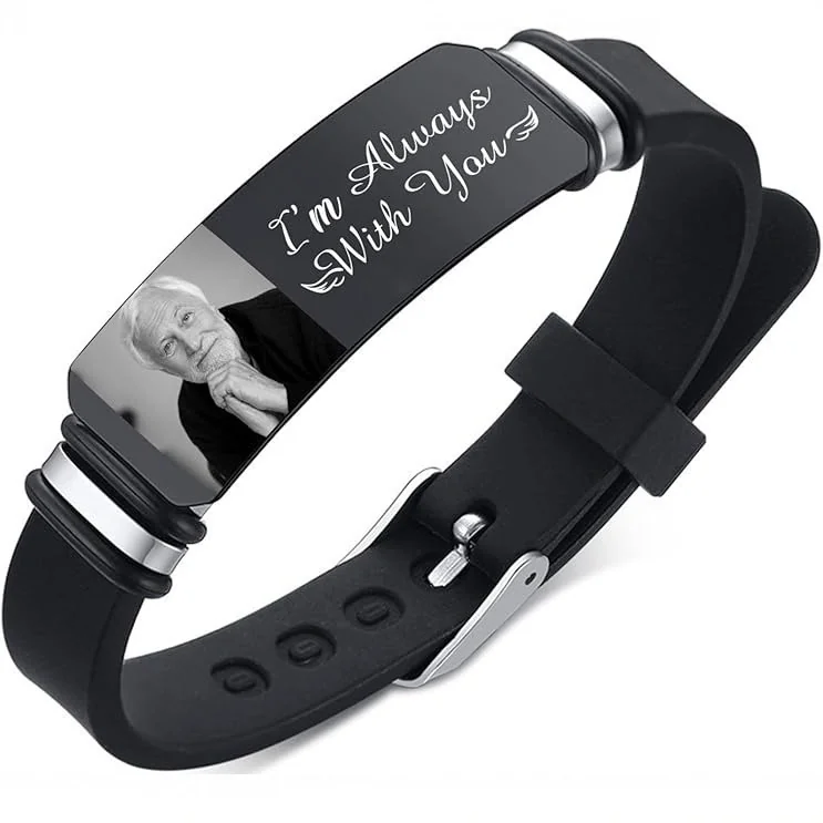
Choose one piece to carry the personal message and let the other add a different visual role. Two competing inscriptions can make both harder to notice.
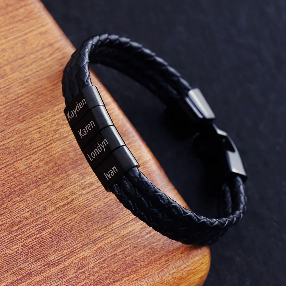
Name the roles before adding pieces
An original two-piece plan might be “names first, quiet texture second.” Another might be “chain outline first, one small word second.” The plan is a styling brief, not a confirmed combination of available options.
Begin by comparing the pieces separately with the same outfit. If neither has a clear role, remove one from the plan rather than adding a third to connect them.
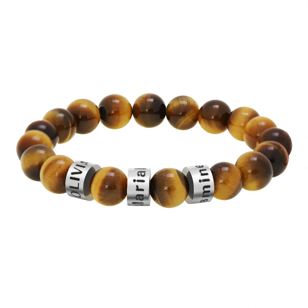
Check the combination as a new arrangement
The Family Bracelet and The Name Bead Bracelet provide different visual references. Their individual size descriptions do not confirm how they would sit together or whether the components would touch.
Obtain actual dimensions and relevant care instructions, then let the wearer assess the arrangement with the actual pieces. Do not describe a stack as comfortable or scratch-free from a mockup. A useful first plan remains small enough to revise one decision at a time.
Assign a distinct purpose to each piece
Write a short role description before placing the references together. One piece might carry the names, while the other introduces a continuous line or texture. If both have strong repeated elements, decide whether repetition is the goal or whether one should receive less attention. There is no need to describe either design as inherently quiet or bold outside the actual comparison.
Keep personal meaning separate from visual prominence. A private inscription can remain important even when it is not the first visible detail. Conversely, a bracelet selected mainly for its outline can lead visually without receiving another inscription. The roles should describe what the wearer wants to notice and recognize.
Compare the pieces individually first
Use the same outfit and viewing conditions for each reference. Ask what the first piece contributes by itself, then repeat the question for the second. Record the answer in ordinary terms such as repeated names, round texture, or two parallel lines. Do not infer comfort, weight, or interaction from the image comparison.
Then put the references together and ask whether both roles are still clear. If one design makes the other difficult to notice, you can revise the roles, change one candidate, or keep a single piece. Adding more accessories is not required to solve an unclear two-piece arrangement.
Separate style approval from stacking feasibility
| Planning question | What can answer it |
|---|---|
| Which piece carries the message? | The wearer's preference and proposed text |
| Which pattern should lead? | A consistent visual comparison |
| Will the pieces share space? | Applicable dimensions and fit information |
| Which components may meet? | A map followed by observation with actual pieces |
| What care limits apply? | Instructions for each exact version |
A visual plan can settle the first two while leaving the remaining questions open. Keep that distinction in the record. A photograph containing multiple bracelets does not prove that they are a confirmed set, included in one price, or approved to be worn together.
A fictional two-piece editing exercise
In this fictional editorial example, Drew wants family names to be the focus and also likes a bead texture. Drew compares a name-element reference alone, then a bead reference alone, beside the same casual shirt. When placed together in the planning comparison, both patterns appear equally prominent.
Drew chooses to keep the family-name design as the main detail and postpones the second piece. That is one acceptable outcome. Another fictional wearer might deliberately want both patterns repeated and retain the two-piece plan, while seeking the required dimensions and care information. The exercise does not declare one result more fashionable.
If the combination later proves physically unsuitable or creates unwanted contact, its styling roles can still be preserved using separate wearing occasions or another arrangement. The visual brief does not require the pieces to occupy the same wrist at every moment.
Review the arrangement one change at a time
After individual fit and applicable instructions are settled, assess the actual intended arrangement. Observe which components rest near each other and whether the preferred message remains visible. Do not perform a rubbing or scratch test to prove compatibility. The observation concerns the arrangement in use, rather than long-term performance.
If you change a piece, sleeve, or watch, repeat the relevant comparison without assuming the previous result carries over. A new clasp or larger personalized area can change what draws attention and where components meet. Record the actual difference rather than treating every revision as a reason to add another item.
Keep the stack brief small and explicit
The final brief can identify the first piece's role, the second piece's role, the proposed placement, and the specifications still needed. If repeated text is intended, provide the exact string for each piece rather than using “same as the other” as the only instruction. Each personalized region still needs independent confirmation.
If only one piece survives the comparison, retain that decision as complete. A stack is an option rather than a requirement. The useful result is a clear role for every accessory that remains, with fit and contact questions documented separately from the styling preference.