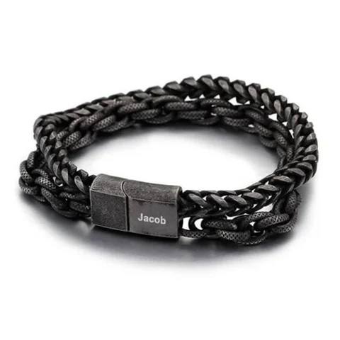
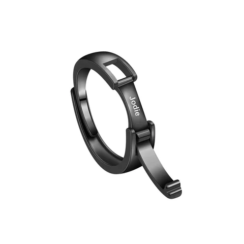
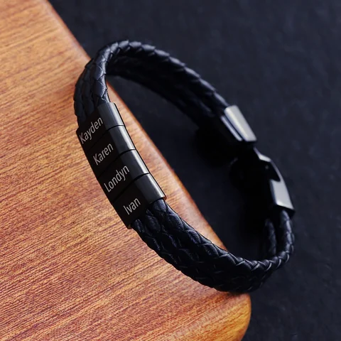
Compare dark and silver-colored details against the same clothing and in the same light. Otherwise, a darker background or a brighter photograph can influence the choice more than the bracelet itself.
Choose one background you recognize
Use a plain shirt, jacket, or watch strap you already wear. Place the reference images beside a photo of that item without changing their color. Then record a preference in ordinary language: “I want the lettering to stand apart” or “I want the whole piece to stay quiet.”
Do not try to infer the exact finished shade from a screen. Camera exposure, reflections, display settings, and the selected variant may differ.
| Question | What a reference image can help with | What needs another source |
|---|---|---|
| Which outline looks quieter? | Your reaction to the visible example | Actual dimensions |
| Does the text contrast with its surroundings? | The pictured example | Finished lettering sample |
| Is the silver-colored part silver? | Nothing conclusive | Component material specification |
Change one variable at a time
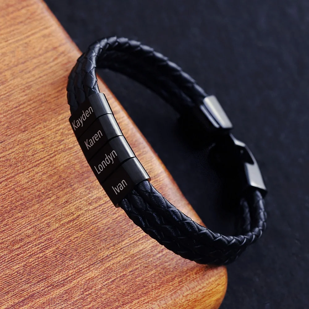
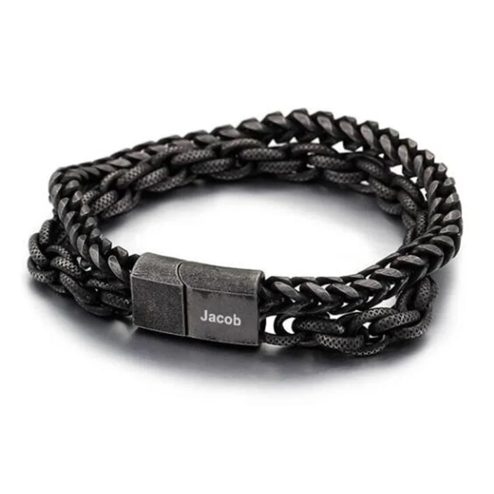
The Family Bracelet and Double Chain differ in shape as well as color distribution. To judge color alone, request the same design and viewing angle in both confirmed options. If those images are unavailable, record the comparison as a preference between these two examples, not a verdict on every dark or silver-colored bracelet.
Keep the color choice provisional until the intended option is identified. It should never become evidence of plating, base metal, or resistance to fading.
Decide what the color is meant to accomplish
A color preference becomes easier to discuss when it has a purpose. You may want the bracelet to blend into a dark outfit, give a light watch strap a second visual reference, or make the inscription stand out. Write the intended effect before comparing the pictures. The same dark example can feel quiet in one combination and prominent in another.
Keep three visual elements separate: the band, the text-bearing part, and the lettering itself. A bracelet with a dark band and a bright panel creates a different relationship from a dark panel with lighter lettering. Asking for a silver-colored version without naming the component can leave the request ambiguous.
Make an original comparison sheet
For a fictional styling exercise, use a navy shirt and a silver-colored watch case already owned. One sheet places the dark Family Bracelet reference beside the outfit. Another places the Double Chain reference in the same position. Record which part of each reference attracts attention first. If the names lead in one and the strand pattern leads in the other, color is only part of the difference.
Next, cover the watch image and look again. The preferred reference may change because its role in the combination changed. This is a valid personal observation. It does not establish that one color suits everyone or that the pictured shade will match the finished item.
You can also compare the images against a plain light background and a plain dark background. Keep the product images intact. The exercise is about recognizing your visual response, not modifying the pictures until they suggest an exact color match that has not been confirmed.
Request a comparison that controls the other differences
If color is the deciding factor, ask for the same design in the available reference options, photographed from a similar angle. Identify the option names in the request. Do not compare a close-up of a bright panel with a distant photograph of a dark braid and call the result a finish comparison.
Ask whether the images show the selected version or a general gallery example. A source photograph may display a configuration different from the proposed one. If the seller cannot connect each image with a specific option, keep the images labeled as visual references.
Lettering contrast deserves its own question. A large screen preview may make an inscription look easy to read because the text has been enlarged. Request a representation of the proposed text at the intended scale and a finished example made by the intended process. Neither a color choice nor a typeface choice supplies that missing evidence.
Avoid turning color language into material language
Use “dark,” “black tone,” or “silver-colored” to describe the visible reference. Use a material name only when a component specification identifies it. A bright metal-like surface does not establish silver content. A dark surface does not identify the substrate or its treatment.
For a mixed design, request the band material, the name-element material, and the closure material separately. Ask for the applicable care guidance after those components and treatments are identified. A visual comparison cannot justify a claim about resistance to fading, scratches, or water.
Record a preference that can survive a clearer photograph
A useful outcome is: “I prefer a dark band with the inscription as the main point of contrast, provided the chosen version has a confirmed text treatment.” Another is: “I prefer bright details that echo my existing watch, but I need a photograph of the actual option.” Both preserve the reason for the preference while leaving the shade provisional.
If a later confirmed image changes the appearance, revisit the visual choice rather than defending the earlier screenshot. The purpose of the exercise is to narrow the design responsibly. The final record should identify the intended contrast, the selected reference option, and the particular evidence still needed to evaluate the finished version.