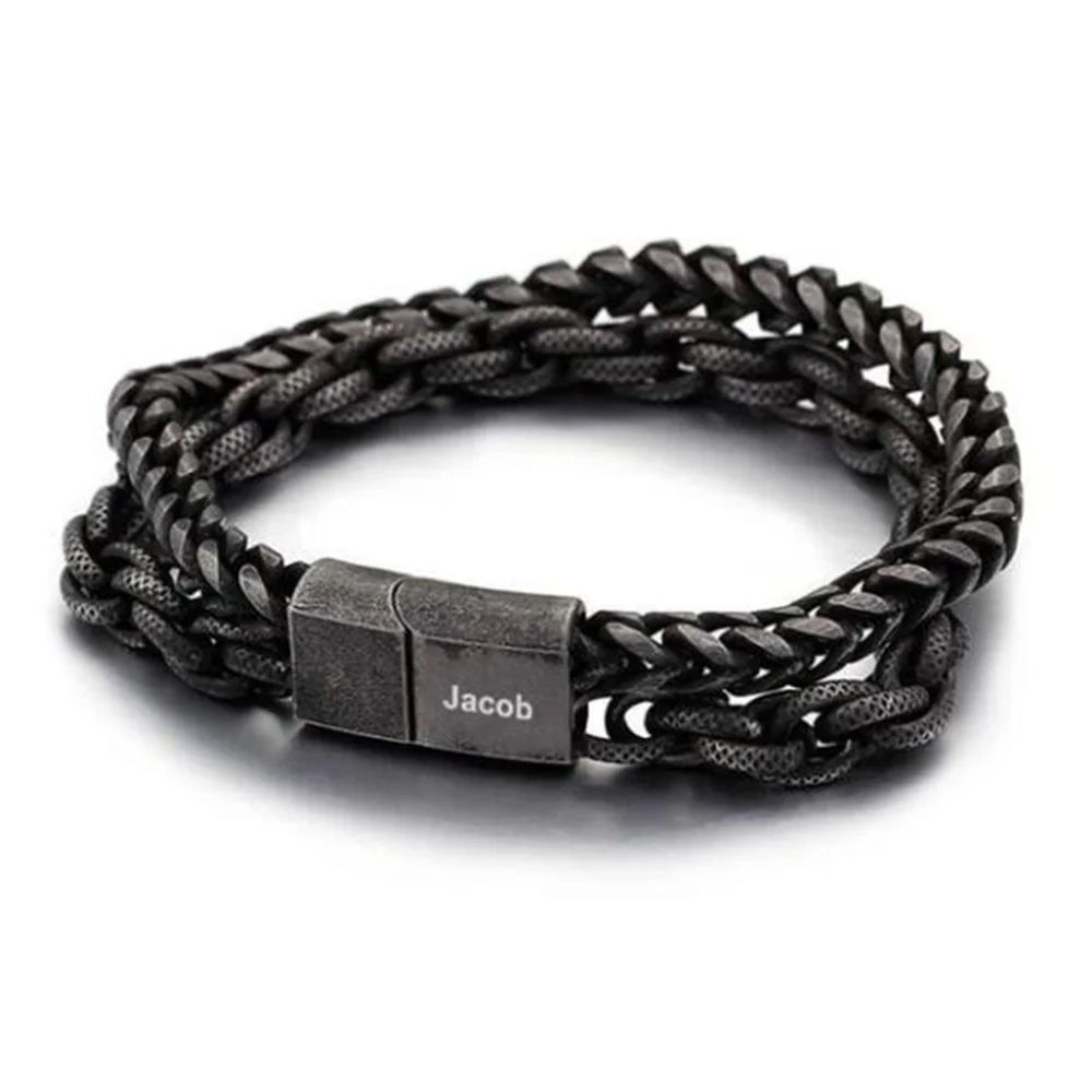
Start with the outline you want to see beside your sleeve. A chain creates repeated link shapes; a braided cord creates a different surface pattern. Neither appearance establishes the material or how the bracelet feels.
Make three comparisons with one shirt
Use a shirt you actually wear, rather than imagining a special outfit for the bracelet. On paper, draw a simple sleeve edge and place the two reference images beside it.
| View | What to compare | A useful preference to record |
|---|---|---|
| From above | Repeated links versus braided texture | Which pattern you want to notice first |
| At the sleeve edge | How much visual space the bracelet occupies | Whether jewelry or the cuff should lead |
| Beside a watch | Two bands versus one repeated surface | Whether the extra line feels visually busy |
This is a styling exercise, not a fit simulation. A resized gallery photo cannot establish clearance, width, or contact with a watch.
Decide what should be the focal point
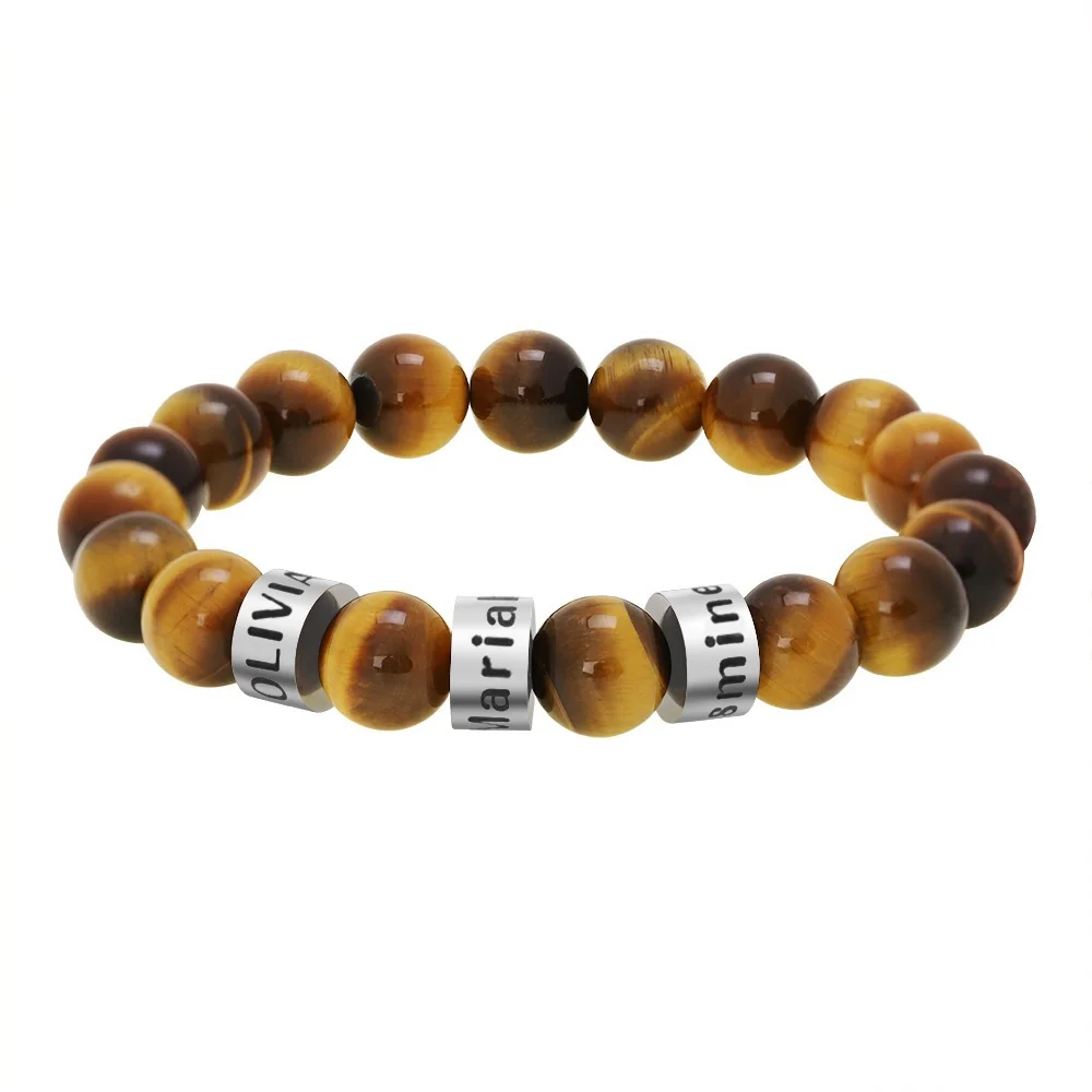
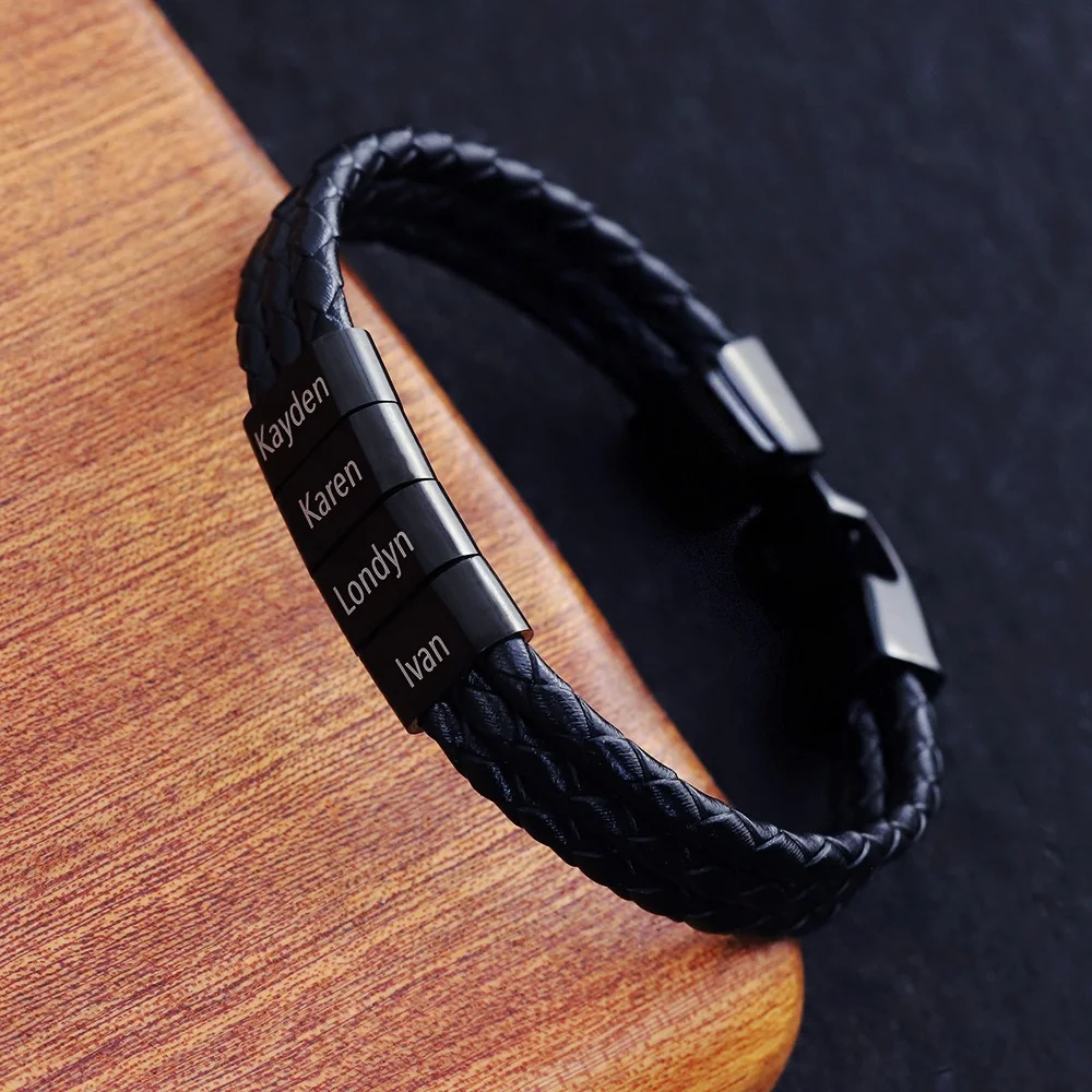
Choose the Family Bracelet reference as a starting point if the names are the detail you want to see. Compare the Double Chain reference if the parallel lines interest you more. Ask for measurements and component materials after the shape decision; do not use the words “cord” and “chain” as a durability ranking.
A useful shortlist note is: “I prefer the linked outline with my plain shirts, but I still need the actual width and finished size.” That sentence separates a preference you can settle now from specifications you still need.
Compare the outline without pretending the photographs are measurements
Put the chain and cord references in a small comparison sheet, but keep the original image proportions. Stretching one image to match the other can make a narrow strand look wide or a round link look oval. Leave a note beside each image identifying which view it shows. A top view and an angled view are different kinds of evidence, even when both look attractive.
Start with two observations you can actually make: where the band changes direction and where its pattern is interrupted. In a linked outline, the individual openings may be the feature you notice first. In a braid, changes in surface direction may create the rhythm. In the Double Chain reference, the two strands also create a relationship with each other. This observation is about the pictured composition, not a claim that the strands move independently during wear.
Use a familiar outfit as the comparison setting
An original planning example starts with a plain gray shirt, a watch already owned, and a preference for a quiet accessory. The viewer first selects the cord reference because its pattern feels less prominent beside that outfit. On a second sheet, the viewer removes the watch and prefers the chain because the repeated links now provide the detail the outfit was missing. Neither result establishes a universal winner. The exercise shows why the intended combination belongs in the brief.
Use the same outfit photograph for both designs. A bracelet pictured on dark wood and another pictured on a bright background can create a misleading comparison. You do not need to retouch either product image. A plain frame around each reference is enough to remind you that its original background is separate from the clothes you would wear.
If a sleeve hides most of the bracelet, think about the portion likely to remain visible. You may prefer a concentrated name detail near the joining component, or you may want a repeated texture along the exposed outline. Actual rotation and placement remain unknown until fit and construction are confirmed, so record this as an intended effect.
Separate three reasons for choosing a design
Write one sentence for appearance, one for personalization, and one for practical uncertainty. For example: “I like the parallel lines. I want one name to be the focal point. I still need to know the finished size and closure procedure.” This is clearer than calling the design a better everyday bracelet, which would imply information the reference does not supply.
A second buyer might write: “I prefer several names separated along a braid. I want the text to read as a family list. I need confirmation of the actual number of name elements.” The different brief can justify a different visual starting point without ranking one structure above the other.
Keep material questions in their own list. Ask about the chain, cord, joining component, and lettering surface individually. Even if a source names one material, that description may not identify every component. Do not convert a visual preference for a chain into a conclusion about strength, or a preference for a braid into a conclusion about softness.
Decide what would change your shortlist
Choose a reason to pause before requesting personalization. If the design must clear an existing watch, a confirmed measurement is essential. If the names must remain separate, a single text region may be unsuitable regardless of the surrounding outline. If one-handed fastening is required, the closure procedure can outweigh your first visual preference.
At the end of the exercise, keep one preferred outline and one alternative. Record the unanswered question that could reverse their order. This gives the next comparison a purpose: obtain a specification that resolves that question, rather than collect more attractive photos that cannot answer it.