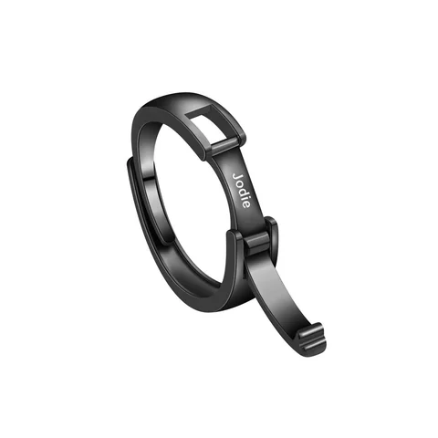
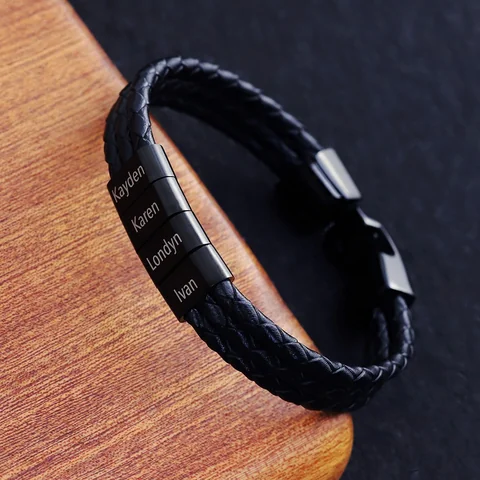
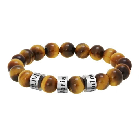
Choose the location before choosing the lettering. A ring puts a name on the hand; a bracelet puts it around the wrist. A necklace introduces another position and a different viewing angle. The name can stay the same while the design requirements change.
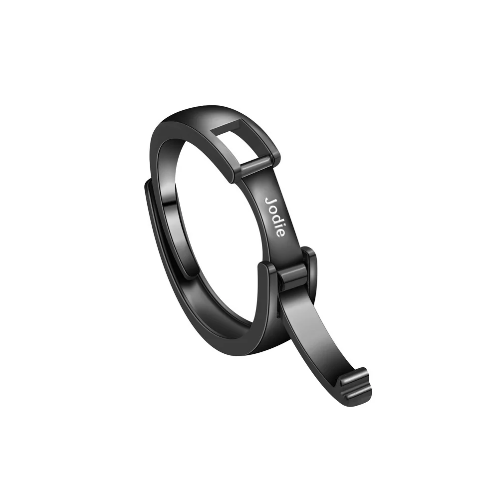
Use the wearer's existing habits
Ask which piece they already reach for. Someone who wears rings but rarely wears a bracelet may prefer a ring-shaped starting point. Someone who removes rings during their usual activities may choose another location. This is personal preference, not a rule about gender or age.
Prepare a brief with these entries:
- Message: the exact name and preferred capitalization.
- Location: finger, wrist, or neck.
- Visibility: readable to the wearer, visible to others, or kept discreet.
- Existing piece: the item whose position and feel they already like.
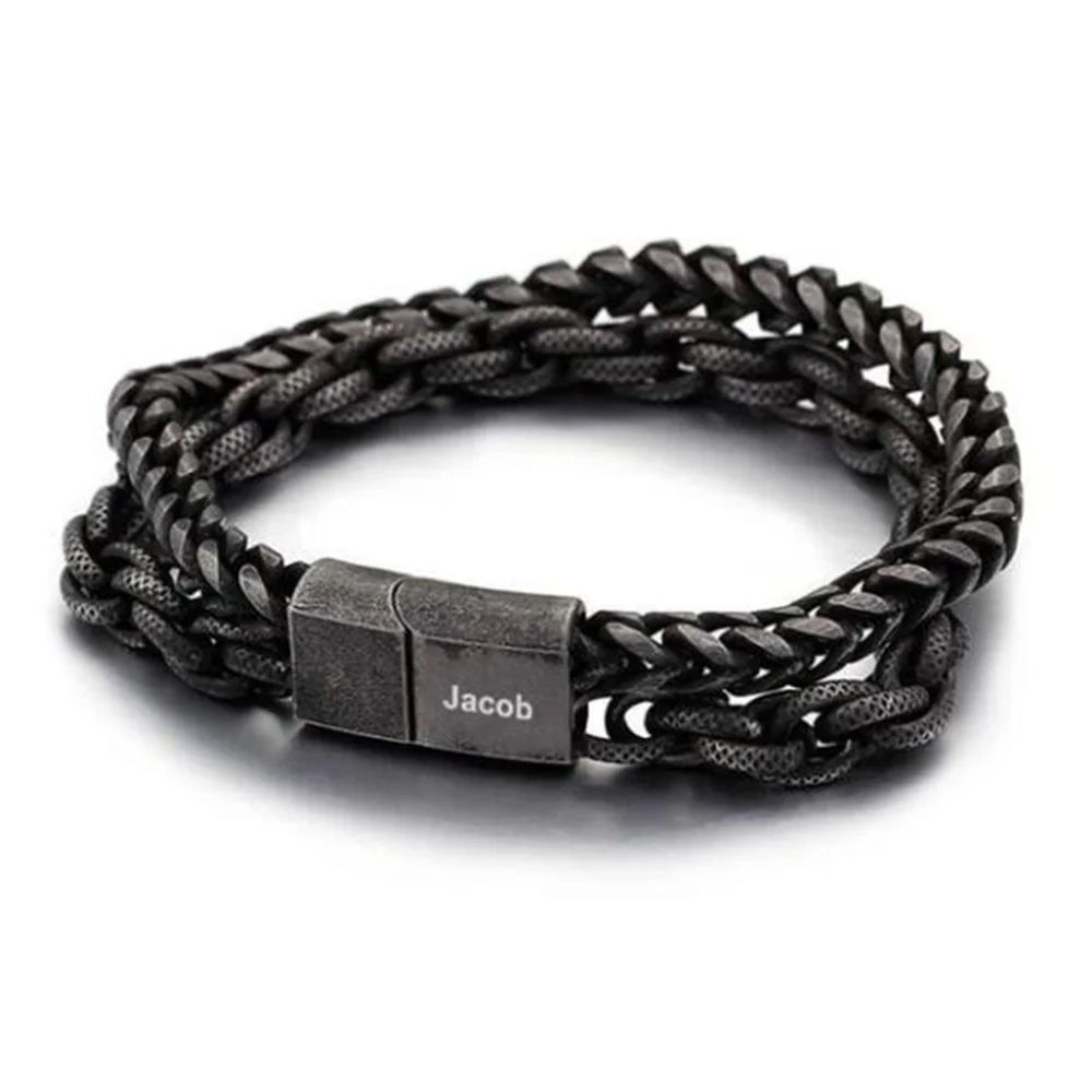
Do not carry a layout across categories
The Name Ring and Double Chain offer different visual references. A text layout approved for one would not automatically establish usable space on the other. Confirm the region and scale for each design independently.
If considering the Anchor Necklace too, include the wearer's usual collar opening in the brief. The supplier's chain-length statement needs its own check; a wrist measurement does not help choose necklace placement.
The result should be one chosen location and one exact text draft. That is a clearer next step than trying to design three accessories at once.
Follow one name through an ordinary day
Use an imagined day to identify where the name would be noticed. A ring might be seen while the wearer looks at their hand. A bracelet might be seen beside a sleeve or watch. A necklace may be visible at an open collar or remain covered. These are placement possibilities, not predictions about how the references will sit on a particular person.
The important question is whose reading experience you are designing. If the inscription should be easy for the wearer to see, ask about its orientation in the chosen location. If it should be visible in conversation, consider whether the wearer wants that personal detail displayed. If it is meant as a private reminder, the most publicly readable position may be the wrong starting point.
Keep the spelling master while changing the format
Imagine the fictional name “Robin.” Write it once with the capitalization the person actually prefers. Then draw three planning cards labeled finger, wrist, and neck. Copy the same text to all three without shortening it. This holds the meaning steady while you compare placement. The cards do not establish available engraving space.
After choosing a location, ask what compromises that location would require. If the preferred ring cannot support the chosen spelling legibly, the options include choosing another design, moving the message, or deliberately changing the text. Do not silently shorten someone else's name to preserve a shape selected earlier.
A bracelet may create more than one visible region in its reference image, but that does not prove additional text areas are usable. Likewise, a necklace pendant may show a front face without establishing a customizable reverse. Request the specific region rather than describing the whole accessory as engravable.
Build two separate fit requests
For a ring request, identify the intended finger and the relevant size reference. For a bracelet request, identify the wrist measurement and the maker's sizing method. Putting these questions in separate notes prevents a familiar ring-size number from creating false confidence about a wrist piece.
If the wearer already owns both types of accessory, ask what they like about the position of each. Their answer may mention visibility, daily removal, or how much jewelry they want to wear together. Record those preferences in their words. Do not generalize them into claims that rings are always more comfortable or bracelets are always more practical.
When a necklace enters the comparison, add chain-length and pendant-position questions. The neckline example can guide a visual discussion, but actual pendant dimensions and chain information still need confirmation. A bracelet screenshot cannot answer where a necklace will hang.
Use a decision rule that respects the wearer
Choose the familiar location if the wearer has a clear preference and the relevant specifications can be supplied. Choose the more visible location only if visibility is wanted. Choose another format if the exact text is essential and the first design cannot accommodate it. These rules connect a requirement with a reason, rather than ranking accessories by stereotype.
A gift planning note could say: “Robin prefers a ring because that is the piece they already wear. The name must remain Robin, with a capital R. We need confirmation of the actual inscription region and the correct size before considering a final layout.” This is an original example of a complete direction, not an approved order.
Leave the alternative location in the note only if it solves a specific unresolved issue. For example, a bracelet could be the fallback if the ring's text area is too limited. Comparing three accessories indefinitely is less useful than identifying the information that would make one suitable. The resulting brief should preserve the name, state the intended reading experience, and explain what must be verified next.