Compare the same words in both versions. Changing the wording while changing the case makes it difficult to tell which choice improved the message.
Keep a controlled text comparison
Use an original sample such as “Find your way.” Prepare “FIND YOUR WAY” and “Find your way” with the same punctuation decision. Mixed case can preserve the familiar shape of a personal name; uppercase may be the wearer’s deliberate preference. Neither is universally more suitable.
Check names before treating case as decoration. “McKay” and “MCKAY” represent the same letters, but the wearer may prefer the internal capital to remain visible. Do not change a person's chosen spelling style without asking.
Ask for the two versions at one scale
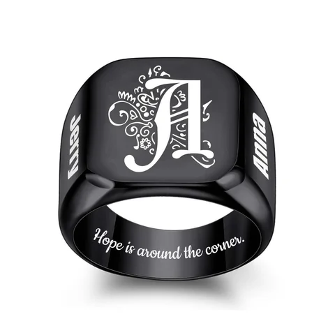
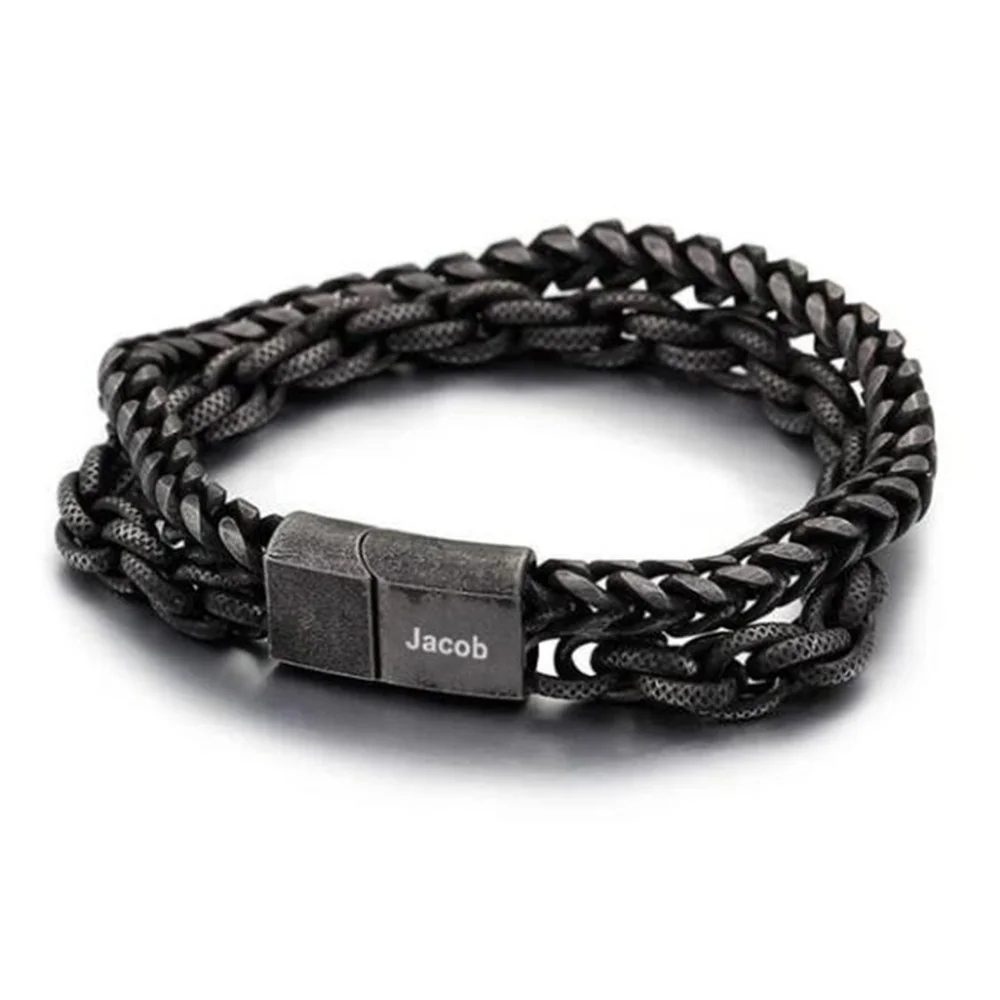
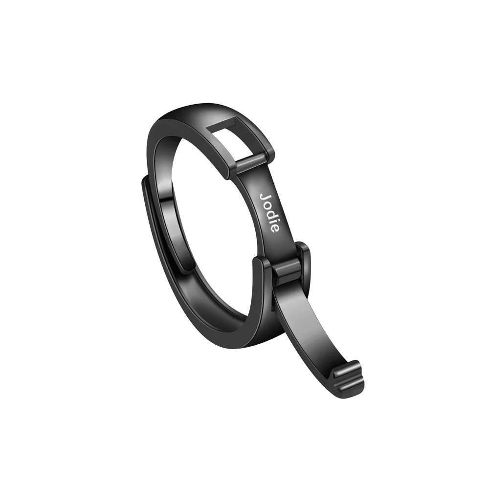
Request the same text, same region, same font, and same approximate finished scale for The Double Chain or The Name Ring. Check spaces within letters, word spacing, and the beginning and end of the string. A large monitor preview cannot establish the final mark's readability.
Record the selected version as an exact string. “Use mixed case: Find your way” is clearer than “make it look softer.” Keep production approval separate from this editorial comparison.
Decide whether capitalization is part of the identity
For a personal name, capitalization may be an intentional part of how the person writes it. Preserve that preference before comparing visual treatments. A name with an internal capital, a lowercase preference, or another chosen pattern should not be standardized by the giver without asking.
For a phrase, start with its intended voice. A fictional wearer might choose “Stay curious” because it reads like a familiar sentence. Another might choose “STAY CURIOUS” because that is the exact presentation they prefer. Both are valid requests to investigate; neither establishes that the maker's selected font supports the desired treatment well.
Make a comparison that changes only case
Prepare the uppercase and mixed-case versions with identical wording and the same punctuation choice. Put them in separate rows rather than selecting different font styles for each. If you change font, case, and word spacing simultaneously, you cannot identify which change produced your preference.
Ask for the same named typeface, the same region, and the intended lettering size. If the maker must scale one version differently to fit, ask it to state that difference. You can then evaluate the real alternatives rather than assume the proof held every variable constant.
Use an original sample such as “Our next chapter” for a paper comparison. Do not infer finished engraving quality from the paper text. The sample helps you notice your preference for the word shapes; a production proof and appropriate finished example still need to show the proposed treatment.
Look at the whole phrase and the individual letters
First read the complete string without focusing on decoration. Can you recognize the intended words? Then inspect the beginning, middle, and end. Check whether any letters appear crowded or whether a space between words is unclear. A readable center does not guarantee that the first or last letter is positioned as intended.
For a name, compare the proof directly with the text master. Decorative lettering can distract from a missing letter or an unintended capital. Read each character in order before judging whether you like the overall appearance.
Do not make a universal readability claim from one example. The result belongs to the particular words, font, region, and scale shown. If another name is substituted later, repeat the comparison using that name instead of assuming the earlier case choice resolves it.
Consider the line arrangement as its own decision
A one-line phrase and a two-line phrase can have different rhythms even with the same capitalization. If a line break is proposed, write exactly where it occurs and ask whether the selected region supports it. Do not allow an automatic preview wrap to become an accidental layout instruction.
For “Our next chapter,” keeping the words together may be the preferred reading experience. Dividing the phrase after “next” is another arrangement to discuss, not a case change. Separate those choices so the final request has both a clear text version and a clear layout direction.
In a multiple-name design, decide whether every name should use the same capitalization treatment or retain each person's preference. Equal treatment can mean respecting different spellings. Do not force a name with an internal capital into an unwanted pattern solely to make the row uniform.
Write the selected request without mood words
Instead of “make it stronger,” submit the exact uppercase string if uppercase is what you want. Instead of “make it softer,” submit the exact mixed-case version. Mood words can describe your preference, but they do not specify the letters the maker should receive.
A final planning note might say “Use Stay curious, capital S only, no period; show this exact text in the confirmed region.” That is a fictional brief illustrating precision. It is not an approved option for the referenced bracelet.
If the maker proposes a different case because of its available process, compare that proposal explicitly. Accept it only if the wearer likes the resulting text. Keep the original preference in the record so a manufacturing limitation does not quietly become a claim that the alternative is universally better.