Preserve the handwriting before cleaning up its appearance. Keep the original paper or original image, then make a separate copy for the production discussion. Do not trace over distinctive strokes and call the result the original handwriting.
Prepare one clear source and one marked note
Photograph the writing straight on in even light, keeping the camera steady and avoiding a shadow across the strokes. Keep the original file. If you crop a copy, leave enough context to identify the intended words and avoid clipping the first or last stroke.
In a separate note, specify:
- Which words should be reproduced.
- Whether a flourish or signature mark belongs in the final image.
- Which marks are stains or unrelated writing.
- Whether any proposed cleanup must be approved first.
Ask about capability before file specifications
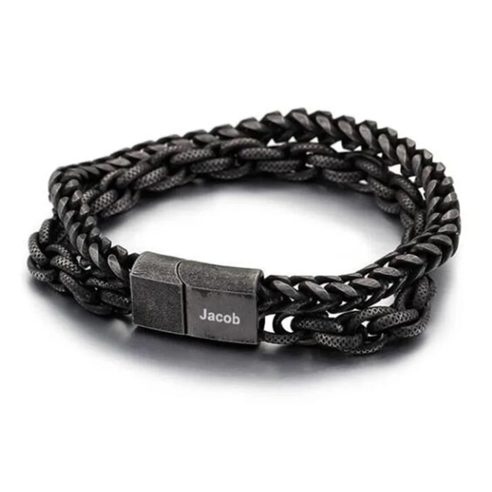
The current records do not approve handwriting reproduction for The Open Cuff or The Double Chain. Ask whether it is supported on the exact option before choosing a file format or adjusting the image to an invented resolution requirement.
If supported, compare the processed proof with the original for missing strokes and changed letter connections. A cleaner result is not an improvement if it removes the feature the wearer wanted to keep.
Decide what needs to survive the transfer
A handwriting request has two different goals: preserving the writer's mark and making the intended words recognizable. Write down which goal matters more for this particular gift. If the writer's uneven baseline is the meaningful detail, a perfectly straight replacement may defeat the purpose. If the message must be read by someone unfamiliar with the writer, an unreadable section needs an explicit decision before layout begins.
Choose a small passage from the original rather than asking a designer to extract an entire letter without guidance. Identify the beginning and ending words in a plain-text transcript. Keep that transcript separate from the image; it explains your interpretation without pretending that typed text is the handwritten source. When a letter is genuinely uncertain, mark it as uncertain in the note instead of silently deciding what the writer meant.
Look for practical obstacles in your own copy: a fold across a letter, ink showing through from the reverse, a bright reflection, or an overlapping line of writing. You can identify these problems without promising that software can remove them. A replacement photograph may help with glare, while a damaged original may require accepting the damage or choosing a different passage. Preserve both attempts so the reviewer knows which file is the source and which is a working copy.
Make the file pair easy to understand
Use descriptive filenames such as original-note-full and requested-phrase-crop. Do not name an edited file original. Put arrows or circles on a third, annotated copy if you need to show an unwanted stain. Marks drawn on the only production image can become ambiguous: the reviewer may be unable to tell whether the arrow itself belongs in the finished design.
Your accompanying note can say: “Reproduce the words shown in the crop, including the long final stroke. The dot above the last word is a paper stain. Please show any proposed removal before proceeding.” That is an editorial example of an instruction, not a claim that a particular cleanup or engraving process is available. It gives the reviewer a concrete distinction to resolve.
If the original contains several signatures or several versions of the same word, choose one source explicitly. Combining a letter from one signature with a letter from another creates a reconstruction. That may be acceptable to the recipient, but describe it honestly and obtain their approval. Do not let an attractive composite quietly become evidence of an authentic single handwritten message.
Work through a fictional comparison
In this fictional example, a grandson wants the words “See you soon” from a grandparent's note. The original includes a sweeping underline that crosses the final letter. He prepares a full photograph, an untouched crop, and a separate annotation explaining that the underline should remain. His transcript contains the words but no underline, because the transcript records language rather than artwork.
The first proposed proof straightens the words and removes the crossing stroke. He compares it with the crop and notices that the result has lost the feature he wanted. His response identifies that precise change rather than saying “make it more personal.” If retaining the crossing stroke would make the phrase unclear at the proposed scale, he can choose a larger confirmed region, select a different passage, or keep the handwriting on the gift card. None of those decisions requires inventing a bracelet capability.
Review identity and placement separately
For a supported request, first compare the artwork without the jewelry mockup. Check the initial strokes, joins between letters, descenders, punctuation, and any included flourish. Then review placement on the exact piece: where the phrase starts, whether a curve changes its orientation, and whether the proof has identified the usable region. A correct drawing placed on the wrong surface still fails the brief.
Keep the original, accepted processed artwork, placement proof, and written approval together. If the region or product option changes, reopen the placement decision. The finished preparation should let another person identify the chosen handwriting and the approved changes without guessing from a folder of similar images.